Our solar panels started generating energy when they were installed last fall, but due to technical difficulties we hadn’t been able to actually see how much energy we were saving. Now, at last, we are able to see the impact that the sun is having on our energy consumption and our energy bill!
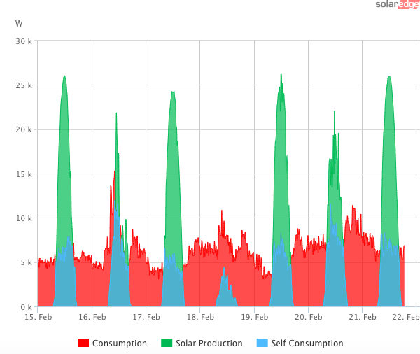
This image shows the past week’s data. The red area shows what we consume, while the green area shows what our panels generate above and beyond what we consume. Except for February 18th (which was a cloudy, rainy day), our generation greatly exceeded our consumption during the day time. During such periods, our meter actually runs backward, and we earn energy credits for the excess energy that we send back to NYSEG. The blue area shows the energy that we consume from our solar panels. During the day time, this is typically our entire consumption — except on cloudy days like the 18th.
More data, and graphs, will come– but we wanted to let you in on this as soon as we got the data! And note that February is still winter. As we move into spring and summer, the green peaks will grow taller and wider as the sun gets stronger and stays above the horizon longer.